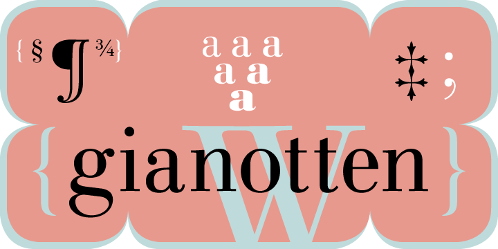
Linotype Gianotten Pro Heavy Italic-Schriftart
Lizenz: Bezahlt
Autor: Linotype
Sprachen:
Latein
Schriftinformationen
Wir haben alle wichtigen Informationen rund um die Schriftart Linotype Gianotten Pro Heavy Italic zusammengetragen. Unten finden Sie eine Tabelle über die Version der Schriftartdatei, die Lizenz, das Urheberrecht, den Designer und den Namen des Anbieters. Die Informationen werden aus der Schriftdatei "TTF" entnommen.
| Name der Schriftfamilie | Linotype Gianotten Pro Heavy Italic |
| Schriftartenname | Linotype Gianotten Pro Heavy Italic |
| Name des Stils | Heavy Italic |
| Schriftart-ID | com.myfonts.easy.linotype.gianotten.pro-heavy-italic.wfkit2.version.3JB7 |
| Schriftversion | 1.000 |
| Warenzeichen | Linotype Gianotten is a trademark of Linotype GmbH and may be registered in certain jurisdictions. |
| Designer | Antonio Pace |
| Designer-Link | http://www.linotype.com/fontdesigners |
| Link zum Verkäufer (Vendor) | http://www.linotype.com |
| Hersteller | Linotype GmbH |
| Urheberrechte © | Copyright © 2000 - 2008 Linotype GmbH, www.linotype.com. All rights reserved. This font software may not be reproduced, modified, disclosed or transferred without the express written approval of Linotype GmbH. Linotype Gianotten is a trademark of Linotype GmbH and may be registered in certain jurisdictions. This typeface is original artwork of Antonio Pace. The design may be protected in certain jurisdictions. |
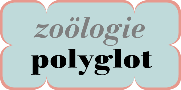
| Beschreibung | It took the Italian designer Antonio Pace more than five years to create Linotype Gianotten, a successful new interpretation of the classic Bodoni types. To re-draw the 200-year-old characters for the world of modern digital technology, Pace studied Giambattista Bodoni's original punches at the Bodoni Museum in Parma. He felt that previous Bodoni interpretations were not well suited for body texts, so he focused his study of Bodoni's "Manuale Typografico" on the types made specifically for text sizes. Consequently, his Bodoni has strong hairlines, rounded transitions and shorter, fluted serifs - elements that help to achieve readability by providing an overall tranquil effect. This contemporary, highly readable family is an excellent choice for text settings in books, newspapers, and magazines. Incidentally, the name Gianotten has nothing to do with Bodoni, but was chosen by Pace and Linotype to honor Dutch typographer, Henk W. J. Gianotten. |
Ähnliche Schriftarten
- Linotype Gianotten Pro Light
- Linotype Gianotten Pro Light Italic
- Linotype Gianotten Pro Regular
- Linotype Gianotten Pro Italic
- Linotype Gianotten Pro Medium
- Linotype Gianotten Pro Medium Italic
- Linotype Gianotten Pro Bold
- Linotype Gianotten Pro Bold Italic
- Linotype Gianotten Pro Black
- Linotype Gianotten Pro Heavy
- Linotype Gianotten Gianotten Light
- Linotype Gianotten Gianotten Light Italic
- Linotype Gianotten Gianotten Regular
- Linotype Gianotten Gianotten Italic
- Linotype Gianotten Gianotten Medium
- Linotype Gianotten Gianotten Medium Italic
- Linotype Gianotten Gianotten Bold
- Linotype Gianotten Gianotten Bold Italic
- Linotype Gianotten Gianotten Black
- Linotype Gianotten Gianotten Heavy
- Linotype Gianotten Gianotten Heavy Italic
- Linotype Gianotten Gianotten SC Light


Bemerkungen