Optima Std Medium Italic-Schriftart
Lizenz: Bezahlt
Autor: Linotype
Sprachen:
Latein

Schriftinformationen
Wir haben alle wichtigen Informationen rund um die Schriftart Optima Std Medium Italic zusammengetragen. Unten finden Sie eine Tabelle über die Version der Schriftartdatei, die Lizenz, das Urheberrecht, den Designer und den Namen des Anbieters. Die Informationen werden aus der Schriftdatei "TTF" entnommen.
| Name der Schriftfamilie | Optima Std Medium Italic |
| Schriftartenname | Optima Std Medium Italic |
| Name des Stils | Medium Italic |
| Schriftart-ID | com.myfonts.easy.linotype.optima.pro-medium-italic.wfkit2.version.54ku |
| Schriftversion | 1.000 Build 1000 |
| Warenzeichen | Optima is a trademark of Monotype Imaging Inc. registered in the U.S. Patent and Trademark Office and may be registered in certain other jurisdictions. |
| Designer | Hermann Zapf |
| Designer-Link | http://www.monotype.com/ |
| Link zum Verkäufer (Vendor) | http://www.monotype.com/ |
| Hersteller | Monotype Imaging Inc. |
| Urheberrechte © | Copyright © 2015 Monotype Imaging Inc. All rights reserved. |
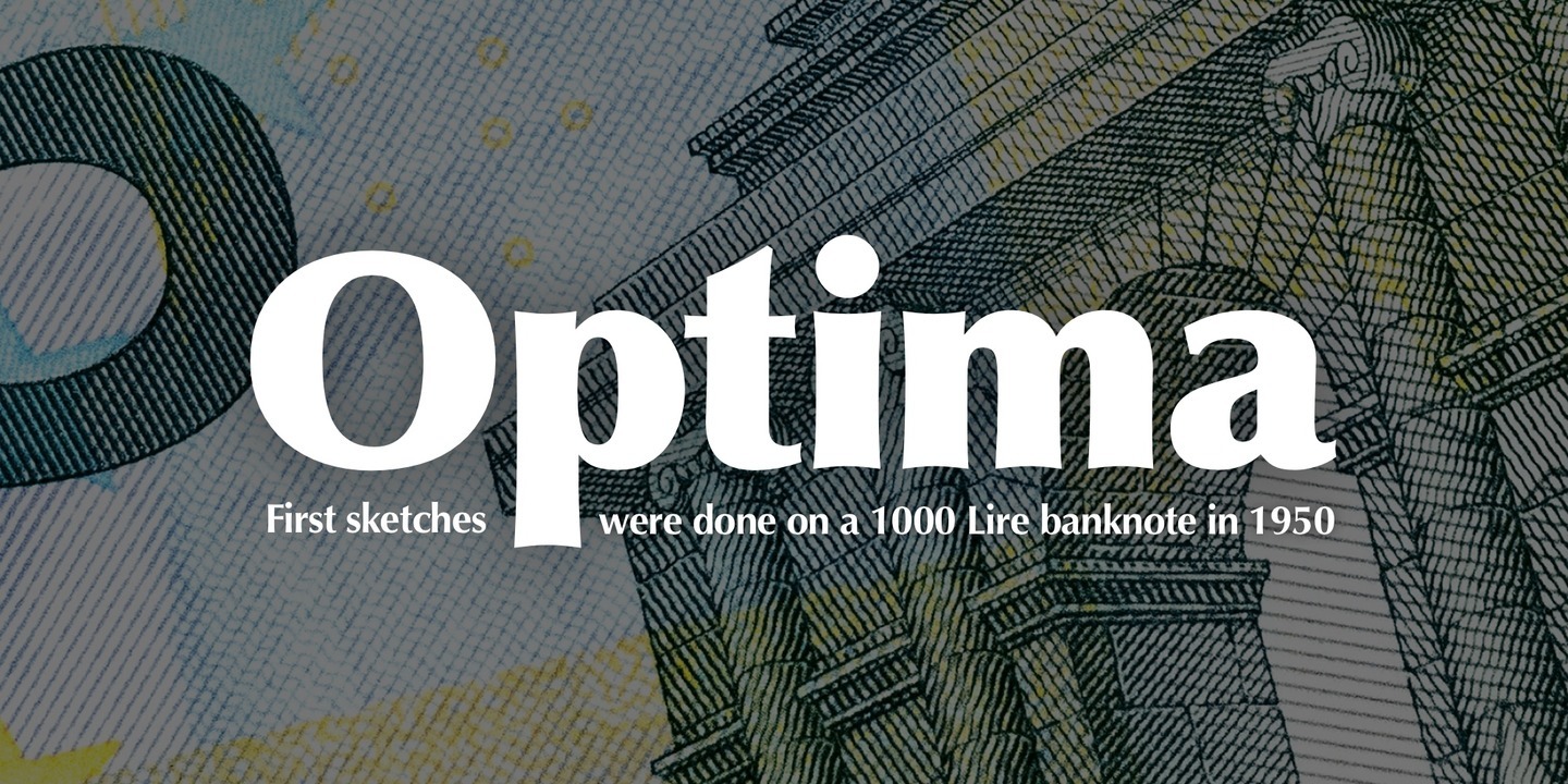
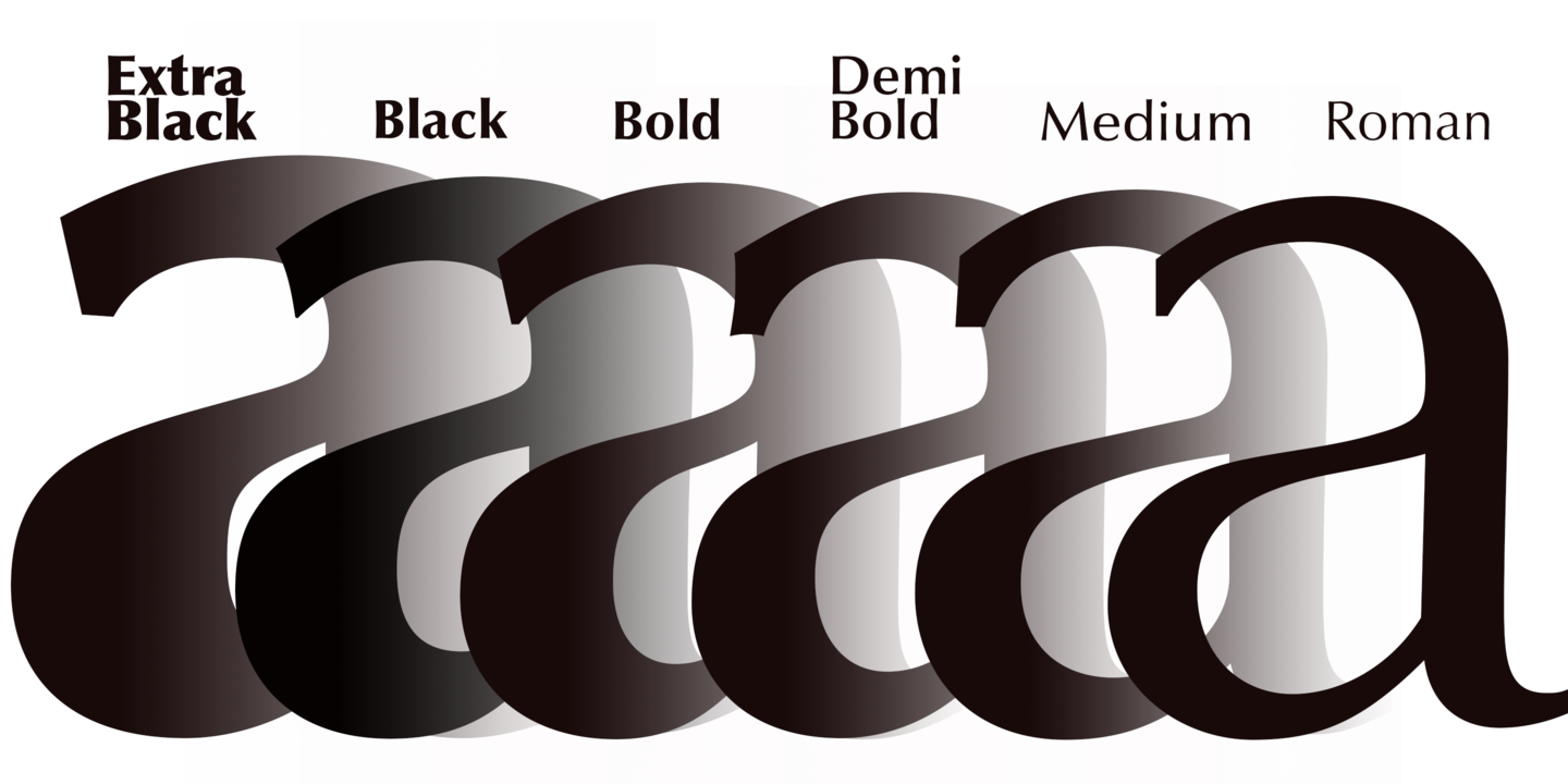
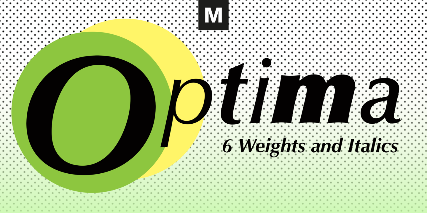
| Beschreibung | Optima was designed by Hermann Zapf and is his most successful typeface. In 1950, Zapf made his first sketches while visiting the Santa Croce church in Florence. He sketched letters from grave plates that had been cut about 1530, and as he had no other paper with him at the time, the sketches were done on two 1000 lire bank notes. These letters from the floor of the church inspired Optima, a typeface that is classically roman in proportion and character, but without serifs. The letterforms were designed in the proportions of the Golden Ratio. In 1952, after careful legibility testing, the first drawings were finished. The type was cut by the famous punchcutter August Rosenberger at the D. Stempel AG typefoundry in Frankfurt. Optima was produced in matrices for the Linotype typesetting machines and released in 1958. With the clear, simple elegance of its sans serif forms and the warmly human touches of its tapering stems, this family has proved popular around the world. Optima is an all-purpose typeface; it works for just about anything from book text to signage. It is available in 12 weights and 4 companion fonts with Central European characters and accents. In 2002, more than 50 years after the first sketches, Hermann Zapf and Akira Kobayashi completed Optima nova, an expansion and redesign of the Optima family. |
Ähnliche Schriftarten
- Optima Pro Roman
- Optima Pro Italic
- Optima Pro Medium
- Optima Pro Medium Italic
- Optima Pro DemiBold
- Optima Pro DemiBold Italic
- Optima Pro Bold
- Optima Pro Bold Italic
- Optima Pro Black
- Optima Pro Black Italic
- Optima Pro Extra Black
- Optima Pro Extra Black Italic
- Optima Std Roman
- Optima Std Italic
- Optima Std Medium
- Optima Std DemiBold
- Optima Std DemiBold Italic
- Optima Std Bold
- Optima Std Bold Italic
- Optima Std Black
- Optima Std Black Italic
- Optima Std Extra Black
- Optima Std Extra Black Italic

Bemerkungen