Meneghino Regular-Schriftart
Lizenz: Frei
Autor: Dmitry Goloub (Moscow, Terrorist State)
Sprachen:
Kyrillisch, Latein


Schriftinformationen
Wir haben alle wichtigen Informationen rund um die Schriftart Meneghino Regular zusammengetragen. Unten finden Sie eine Tabelle über die Version der Schriftartdatei, die Lizenz, das Urheberrecht, den Designer und den Namen des Anbieters. Die Informationen werden aus der Schriftdatei "TTF" entnommen.
| Name der Schriftfamilie | Meneghino |
| Schriftartenname | Meneghino |
| Name des Stils | Regular |
| Schriftart-ID | Thundertype : Meneghino : 25-11-2014 |
| Schriftversion | Version 4.2 |
| Warenzeichen | TT Meneghino is a trademark of Thundertype. PT Sans is a trademark of the ParaType Ltd. |
| Designer | A.Korolkova, O.Umpeleva, V.Yefimov, D.Goloub |
| Designer-Link | http://dmitrygoloub.com |
| Link zum Verkäufer (Vendor) | http://thundertype.com |
| Hersteller | Thundertype Foundry |
| Link zur Lizenz | http://www.paratype.com/public/pt_openlicense_eng.asp |
| Lizenz | ParaType Ltd grants you the right to use, copy, modify this font and distribute modified and unmodified copies of the font by any means, including placing on Web servers for free downloading, embedding in documents and Web pages, bundling with commercial and non commercial products, if it does not conflict with the ParaType Free Font License placed on www.paratype.com/public/pt_openlicense_eng.asp. |
| Urheberrechte © | Copyright © 2013-2014 Thundertype, Dmitry Goloub. Copyright © 2009 ParaType Ltd. All rights reserved. |
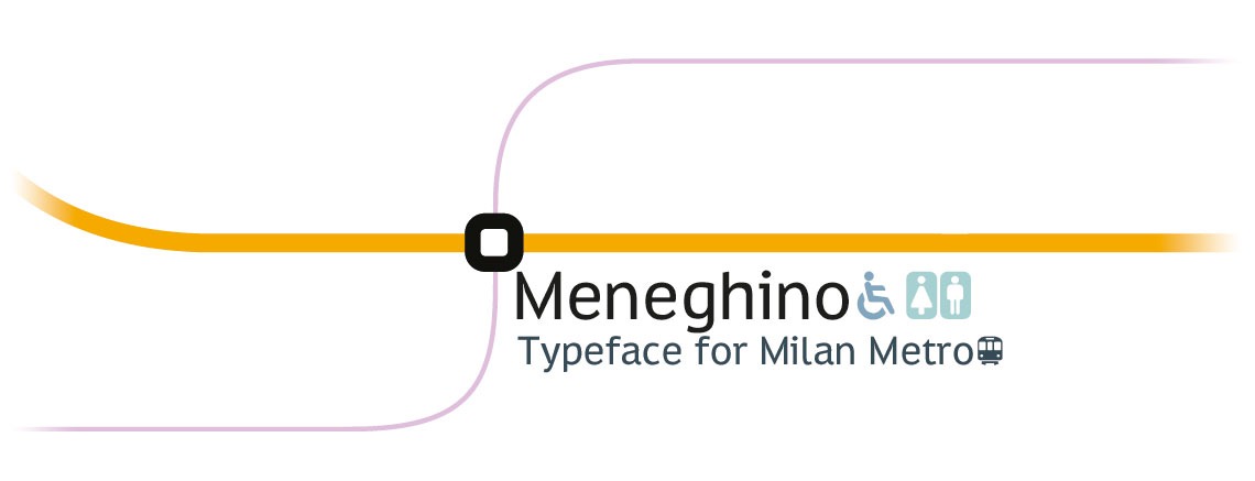
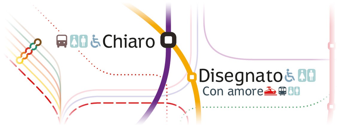
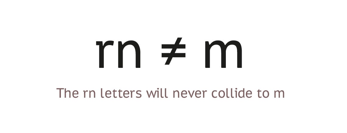
| Beschreibung | Meneghino is created specially for Milan Metro Map and other wayfinding purposes. It is an adapted and slighly more condensed version of PT Sans Caption. Reworked are the Q, the R's leg is a tribute to PRADA, the latin K and k use a new connection. Ligature-encoded pictograms are added to the font. PT Sans is a type family of universal use. It consists of 8 styles: regular and bold weights with corresponding italics form a standard computer font family; two narrow styles (regular and bold) are intended for documents that require tight set; two caption styles (regular and bold) are for texts of small point sizes. The design combines traditional conservative appearance with modern trends of humanistic sans serif and characterized by enhanced legibility. These features beside conventional use in business applications and printed stuff made the fonts quite useable for direction and guide signs, schemes, screens of information kiosks and other objects of urban visual communications. The fonts next to standard Latin and Cyrillic character sets contain signs of title languages of the national republics of Russian Federation and support the most of the languages of neighboring countries. The fonts were developed and released by ParaType in 2009 with financial support from Federal Agency of Print and Mass Communications of Russian Federation. Design - Alexandra Korolkova with assistance of Olga Umpeleva and supervision of Vladimir Yefimov. |

Bemerkungen