Frutiger Neue ExtraBlack-Schriftart
Lizenz: Bezahlt
Autor: Linotype
Sprachen:
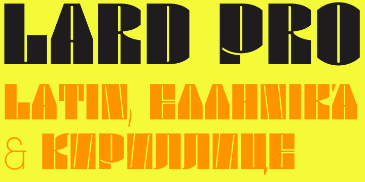
Kyrillisch, Latein


Schriftinformationen
Wir haben alle wichtigen Informationen rund um die Schriftart Frutiger Neue ExtraBlack zusammengetragen. Unten finden Sie eine Tabelle über die Version der Schriftartdatei, die Lizenz, das Urheberrecht, den Designer und den Namen des Anbieters. Die Informationen werden aus der Schriftdatei "TTF" entnommen.
| Name der Schriftfamilie | Frutiger Neue LT W1G XBlack |
| Schriftartenname | FrutigerNeueLTW1G-XBlack |
| Name des Stils | Regular |
| Schriftart-ID | Linotype GmbH:Frutiger Neue LT W1G Extra Black:2010 |
| Schriftversion | Version 1.00 |
| Warenzeichen | Frutiger is a trademark of Linotype Corp. registered in the U.S. Patent and Trademark Office and may be registered in certain other jurisdictions in the name of Linotype Corp. or its licensee Linotype GmbH. |
| Designer | Adrian Frutiger and Linotype Design Studio |
| Designer-Link | http://www.linotype.com/fontdesigners |
| Link zum Verkäufer (Vendor) | http://www.linotype.com |
| Hersteller | Linotype GmbH |
| Link zur Lizenz | http://www.linotype.com/license |
| Lizenz | NOTIFICATION OF LICENSE AGREEMENT You have obtained this font software either directly from Linotype GmbH or together with software distributed by one of Linotype's licensees. This font software is a valuable asset of Linotype GmbH. Unless you have entered into a specific license agreement granting you additional rights, your use of this font software is limited to your workstation for your own use. You may not copy or distribute this font software. If you have any questions regarding your license terms, please review the license agreement you received with the software. General license terms and usage rights can be viewed at www.linotype.com/license. Generelle Lizenzbedingungen und Nutzungsrechte finden Sie unter www.linotype.com/license. Pour plus d'informations concernant le contrat d'utilisation du logiciel de polices, veuillez consulter notre site web www.linotype.com/license. Linotype GmbH can be contacted at: Tel.: +49(0)6172 484-418 |
| Urheberrechte © | Copyright © 2010 Linotype Corp., www.linotype.com. All rights reserved. This font software may not be reproduced, modified, disclosed or transferred without the express written approval of Linotype Corp. Frutiger is a trademark of Linotype Corp. registered in the U.S. Patent and Trademark Office and may be registered in certain other jurisdictions in the name of Linotype Corp. or its licensee Linotype GmbH. This typeface is original artwork of Adrian Frutiger and Linotype Design Studio. The design may be protected in certain jurisdictions. |
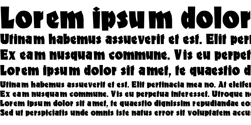
| Beschreibung | Neue Frutiger is an extension and rethinking of Adrian Frutiger's eponymous typeface. In 1968, he was commissioned to develop a navigation system for the new Charles de Gaulle Airport in Paris. Instead of using an existing type, he created a new sans serif suitable for the legibility requirements of signage: easy recognition from the distances and angles of driving and walking. This result was in accord with the modern architecture of the airport. In 1976, Frutiger expanded and completed the design for the D. Stempel AG foundry, in conjunction with Linotype. By 2009, the Frutiger family had five weights, obliques, and condensed variants. Akira Kobayashi, Linotype's type director and long-time collaborator on Frutiger type families such as Avenir Next, began to work on a Neue Frutiger. Now with twice as many weights, this new contribution has been redrawn from the ground up. The curves of the letterforms are more thought through. Instead of straight vectors, many letter contours exhibit a light inward swelling. Minimal ink traps have been added into tight connections. The sides of certain strokes are no longer parallel but slightly angled, to remove unnecessary optical illusions. In other words, Neue Frutiger looks more like a digital "Frutiger" should. Neue Frutiger is a more humanistic interpretation. Its five new weights can be mixed with the existing five weights of the old Frutiger family; the vertical metrics of both family versions are the same. The new "Book" weight is the optimal Frutiger cut for setting long passages of text. The original Frutiger 55 Roman is a bit too dark for this, and Frutiger Next Regular a bit too light and tightly-spaced. Neue Frutiger's fonts include proportionally-spaced and tabular figures, superior and inferior numbers, as well as alternate forms of the & and §. Neue Frutiger has a perfect, existing serif typeface companion: Frutiger Serif. |
Ähnliche Schriftarten
- Frutiger Neue Thin
- Frutiger Neue Thin Italic
- Frutiger Neue Ultra Light
- Frutiger Neue Ultra Light Italic
- Frutiger Neue Light
- Frutiger Neue Light Italic
- Frutiger Neue Book
- Frutiger Neue Book Italic
- Frutiger Neue Regular
- Frutiger Neue Italic
- Frutiger Neue Medium
- Frutiger Neue Medium Italic
- Frutiger Neue Bold
- Frutiger Neue Bold Italic
- Frutiger Neue Heavy
- Frutiger Neue Heavy Italic
- Frutiger Neue Black
- Frutiger Neue Black Italic
- Frutiger Neue ExtraBlack Italic
- Frutiger Neue Condensed Thin
- Frutiger Neue Condensed Thin Italic
- Frutiger Neue Condensed Ultra Light
- Frutiger Neue Condensed Ultra Light Italic
- Frutiger Neue Condensed Light
- Frutiger Neue Condensed Light Italic
- Frutiger Neue Condensed Book
- Frutiger Neue Condensed Book Italic
- Frutiger Neue Condensed Regular
- Frutiger Neue Condensed Italic
- Frutiger Neue Condensed Medium
- Frutiger Neue Condensed Medium Italic
- Frutiger Neue Condensed Bold
- Frutiger Neue Condensed Bold Italic
- Frutiger Neue Condensed Heavy
- Frutiger Neue Condensed Heavy Italic
- Frutiger Neue Condensed Black
- Frutiger Neue Condensed Black Italic
- Frutiger Neue Condensed ExtraBlack
- Frutiger Neue Condensed ExtraBlack Italic
Bemerkungen