Domine Regular-Schriftart
Lizenz: Frei
Autor: Impallari Type
Sprachen:
Latein
Schriftinformationen
Wir haben alle wichtigen Informationen rund um die Schriftart Domine Regular zusammengetragen. Unten finden Sie eine Tabelle über die Version der Schriftartdatei, die Lizenz, das Urheberrecht, den Designer und den Namen des Anbieters. Die Informationen werden aus der Schriftdatei "TTF" entnommen.
| Name der Schriftfamilie | Domine |
| Schriftartenname | Domine |
| Name des Stils | Regular |
| Schriftart-ID | PabloImpallari,RodrigoFuenzalida,BrendaGallo: Domine: 2012 |
| Schriftversion | Version 1.000; ttfautohint (v0.93) -l 8 -r 50 -G 200 -x 14 -w "G" |
| Warenzeichen | Domine is a trademark of Pablo Impallari |
| Designer | Pablo Impallari, Rodrigo Fuenzalida, Brenda Gallo |
| Designer-Link | www.impallari.com |
| Link zum Verkäufer (Vendor) | www.impallari.com |
| Hersteller | Pablo Impallari, Rodrigo Fuenzalida, Brenda Gallo |
| Link zur Lizenz | http://scripts.sil.org/OFL |
| Lizenz | This Font Software is licensed under the SIL Open Font License, Version 1.1. This license is available with a FAQ at: http://scripts.sil.org/OFL |
| Urheberrechte © | Copyright (c) 2012, Pablo Impallari (www.impallari.com|impallari@gmail.com), Copyright (c) 2012, Rodrigo Fuenzalida (www.rfuenzalida.com|hello@rfuenzalida.com), Copyright (c) 2012, Brenda Gallo (gbrenda1987@gmail.com), with Reserved Font Name Domine. |
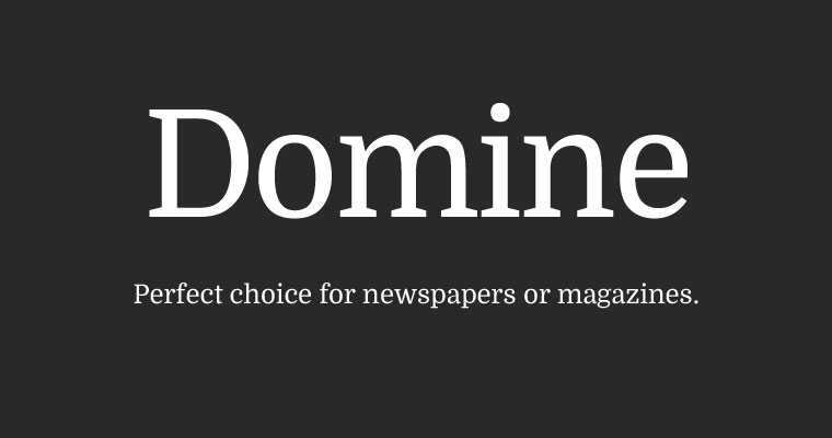
| Beschreibung | From the very first steps in the design process 'Domine' was designed, tested and optimized for body text on the web. It shines at 14 and 16 px. And can even be used as small as 11, 12 or 13px. Harmless to the eyes when reading long texts. Domine is a perfect choice for newspapers or magazines websites, where text is the main focus. It's is friendly in appearance because it combines the classic elements of familiar typefaces that have been in use from more than 100 years like Clarendon, Century, Cheltenham and Clearface. - The rounded letters (b, c, d, e, o, p, q) are a bit squarish on the inside. This feature opens up the counters for better rendering and also make it look a bit more up-to-date than the classic typefaces previously referenced. - The serifs are a bit shorter than usual. Another feature that improves the rendering by allowing more "air" between each letter pair. - The joins of the stems to the branches in letters like h, m, n are deep enough to prevent dark spots, also improving legibility at small sizes. - The friendly lowercase 'a', with the curve starting from the bottom of the stem, is reminiscent of Cheltenham and Clearface. That soft curve is also echoed in the curves of the f, j, n, m and r. - The spacing is also optimized for body text on the web, clearly more open than that of typefaces made for print or for headlines. |


Bemerkungen