DIN Next Decorative Shadow Black-Schriftart
Lizenz: Bezahlt
Autor: Monotype
Sprachen:
Latein
Kategorien:
3D,
Cowboy,
dekorativ,
dick,
für Reklametafeln,
für Schilder,
interessant,
massiv,
Werbung,
Wilder Westen

Schriftinformationen
Wir haben alle wichtigen Informationen rund um die Schriftart DIN Next Decorative Shadow Black zusammengetragen. Unten finden Sie eine Tabelle über die Version der Schriftartdatei, die Lizenz, das Urheberrecht, den Designer und den Namen des Anbieters. Die Informationen werden aus der Schriftdatei "TTF" entnommen.
| Name der Schriftfamilie | DIN Next Shadow Black |
| Schriftartenname | DIN Next Shadow Black |
| Name des Stils | Regular |
| Schriftart-ID | Monotype GmbH:DIN Next Shadow Black:2009, 2018 |
| Schriftversion | Version 1.40, build 14, s3 |
| Warenzeichen | DIN Next is a trademark of Monotype GmbH and may be registered in certain jurisdictions. |
| Designer | Monotype Design Studio 2017, Akira Kobayashi (2009) and Sandra Winter (2009) |
| Designer-Link | http://www.monotype.com |
| Link zum Verkäufer (Vendor) | http://www.monotype.com |
| Hersteller | Monotype GmbH |
| Link zur Lizenz | http://www.monotype.com |
| Lizenz | This font software is the property of Monotype GmbH, or one of its affiliated entities (collectively, Monotype) and its use by you is covered under the terms of a license agreement. You have obtained this font software either directly from Monotype or together with software distributed by one of the licensees of Monotype. This software is a valuable asset of Monotype. Unless you have entered into a specific license agreement granting you additional rights, your use of this software is limited by the terms of the actual license agreement you have entered into with Monotype. You may not copy or distribute this software. If you have any questions concerning your rights you should review the license agreement you received with the software. You can learn more about Monotype here: www.monotype.com |
| Urheberrechte © | Copyright © 2009 - 2018 Monotype GmbH. All rights reserved. |
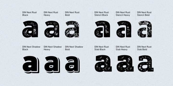
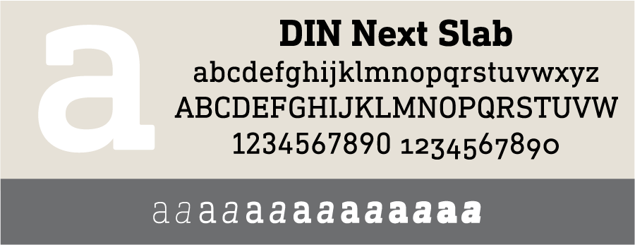
| Beschreibung | DIN Next is a typeface family inspired by the classic industrial German engineering designs, DIN 1451 Engschrift and Mittelschrift. Akira Kobayashi began by revising these two faces - the names just mean condensed and regular - before expanding them into a new family with seven weights (Light to Black). Each weight ships in three varieties: Regular, Italic, and Condensed, bringing the total number of fonts in the DIN Next family to 21. DIN Next is part of Linotype's Platinum Collection. Linotype has been supplying its customers with the two DIN 1451 fonts since 1980. Recently, they have become more popular than ever, with designers regularly asking for additional weights. The abbreviation DIN stands for "Deutsches Institut fuer Normung e.V.", which is the German Institute for Industrial Standardization. In 1936 the German Standard Committee settled upon DIN 1451 as the standard font for the areas of technology, traffic, administration and business. The design was to be used on German street signs and house numbers. The committee wanted a sans serif, thinking it would be more legible, straightforward, and easy to reproduce. They did not intend for the design to be used for advertisements and other artistically oriented purposes. Nevertheless, because DIN 1451 was seen all over Germany on signs for town names and traffic directions, it became familiar enough to make its way onto the palettes of graphic designers and advertising art directors. The digital version of DIN 1451 would go on to be adopted and used by designers in other countries as well, solidifying its worldwide design reputation. There are many subtle differences in DIN Next's letters when compared with the DIN 1451 original. These were added by Kobayashi to make the new family even more versatile in 21st-century media. For instance, although DIN 1451's corners are all pointed angles, DIN Next has rounded them all slightly. Even this softening is a nod to part of DIN 1451's past, however. Many of the signs that use DIN 1451 are cut with routers, which cannot make perfect corners; their rounded heads cut rounded corners best. Linotype's DIN 1451 Engschrift and Mittelschrift are certified by the German DIN Institute for use on official signage projects. Since DIN Next is a new design, these applications within Germany are not possible with it. However, DIN Next may be used for any other project, and it may be used for industrial signage in any other country! DIN Next has been tailored especially for graphic designers, but its industrial heritage makes it surprisingly functional in just about any application. |


Bemerkungen