Amrys Semibold Italic-Schriftart
Lizenz: Bezahlt
Sprachen:
Kyrillisch, Latein

Schriftinformationen
Wir haben alle wichtigen Informationen rund um die Schriftart Amrys Semibold Italic zusammengetragen. Unten finden Sie eine Tabelle über die Version der Schriftartdatei, die Lizenz, das Urheberrecht, den Designer und den Namen des Anbieters. Die Informationen werden aus der Schriftdatei "TTF" entnommen.
| Name der Schriftfamilie | Amrys Semibold |
| Schriftartenname | Amrys Semibold Italic |
| Name des Stils | Italic |
| Schriftart-ID | Monotype Imaging Inc.:Amrys Semibold Italic:2018 |
| Schriftversion | Version 1.00, build 18, g2.5.2.1158, s3 |
| Warenzeichen | Amrys is a trademark of Monotype Imaging Inc. and may be registered in certain jurisdictions. |
| Designer | Ben Jones |
| Designer-Link | http://www.monotype.com |
| Link zum Verkäufer (Vendor) | http://www.monotype.com |
| Hersteller | Monotype Imaging Inc. |
| Link zur Lizenz | http://www.monotype.com |
| Lizenz | This font software is the property of Monotype Imaging Inc., or one of its affiliated entities (collectively, Monotype) and its use by you is covered under the terms of a license agreement. You have obtained this font software either directly from Monotype or together with software distributed by one of the licensees of Monotype. This software is a valuable asset of Monotype. Unless you have entered into a specific license agreement granting you additional rights, your use of this software is limited by the terms of the actual license agreement you have entered into with Monotype. You may not copy or distribute this software. If you have any questions concerning your rights you should review the license agreement you received with the software. You can learn more about Monotype by clicking here: www.monotype.com. |
| Urheberrechte © | Copyright © 2018 Monotype Imaging Inc. All rights reserved. |
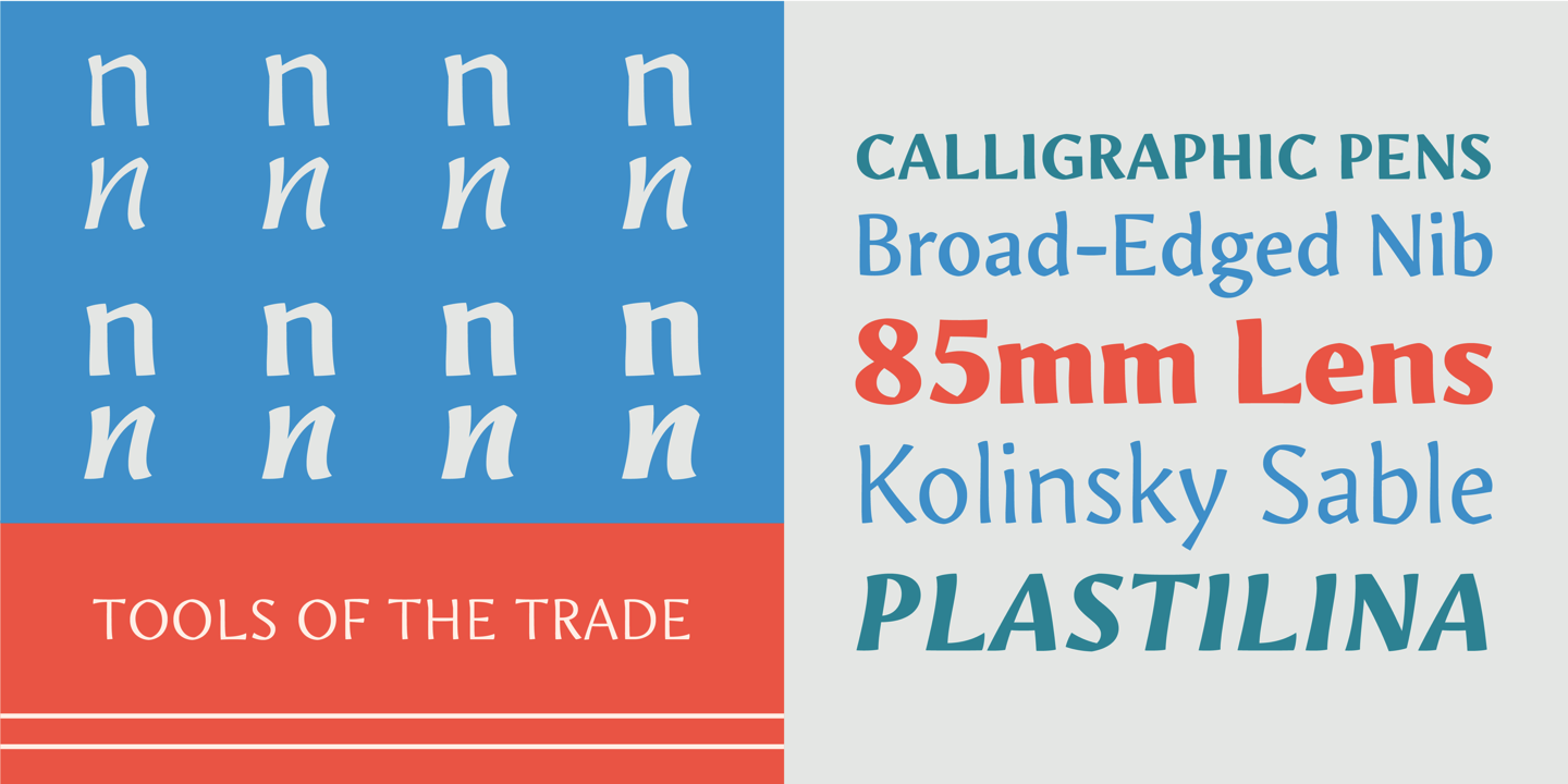
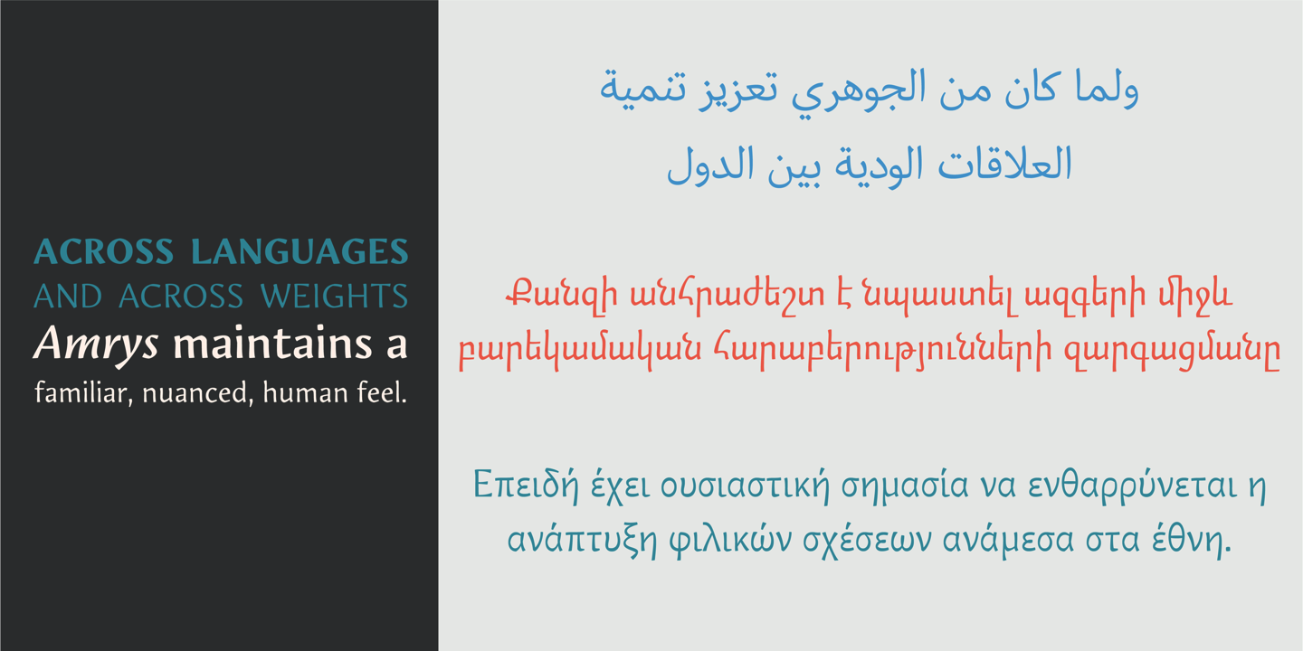
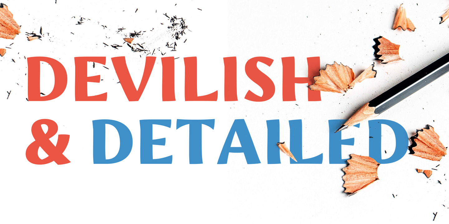
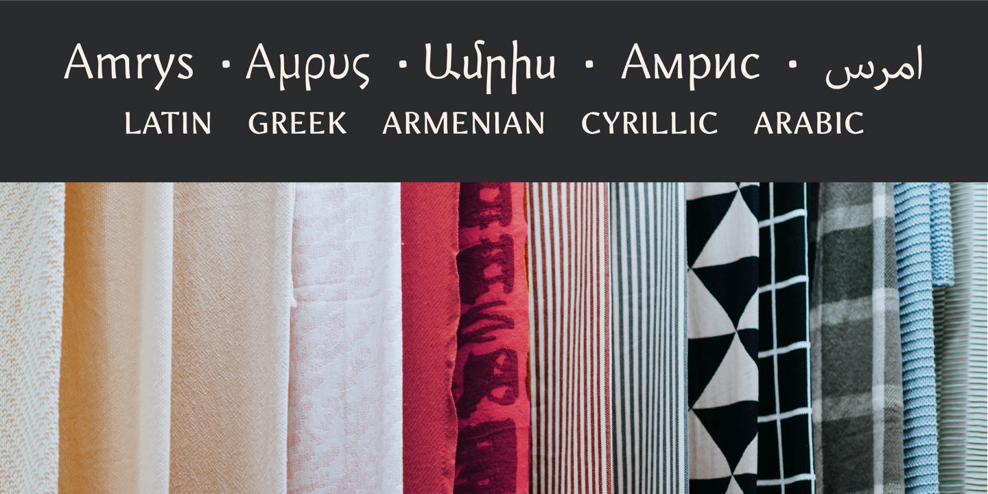
| Beschreibung | Amrys was created by Ben Jones between 2014 and 2018 for the Monotype Library. Amrys is a modulated sans-serif typeface. It has a distinct modernity whilst retaining that familiar, irregular, human feel. Its lively and vibrant tone has been finely balanced to avoid becoming too self-conscious when setting text intended for immersive reading whilst also making it well suited for setting at display sizes. At its heart, Amrys is based on a brushstroke model that has been enhanced withprecise geometrical components, incised elements and a general normalisation of the forms. This creates a sans-serif that has a similar texture to that of a traditional serif typeface and greatly increases the definition of the white space around and between the letters, thereby improving its legibility. Amrys has a relatively high x-height making it suitable for setting at surprisingly small sizes while also giving good economy. The vast amount of subtleties and detailed refinements exhibited at large sizes degrade gracefully as the type is decreased in size, giving continuous text an even colour without becoming distracting. The family has 9 weights, ranging from Light to Black (including italics). Amrys supports multiple scrips: Greek, Armenian, Cyrillic and for the uprights also Arabic. |

Bemerkungen